فصل ۱: کامپوننتهای Owl
This chapter introduces the Owl framework, a tailor-made component system for Odoo. The main building blocks of OWL are components and templates.
In Owl, every part of user interface is managed by a component: they hold the logic and define the
templates that are used to render the user interface. In practice, a component is represented by a
small JavaScript class subclassing the Component class.
To get started, you need a running Odoo server and a development environment setup. Before getting into the exercises, make sure you have followed all the steps described in this tutorial introduction.
نکته
If you use Chrome as your web browser, you can install the Owl Devtools extension. This
extension provides many features to help you understand and profile any Owl application.
In this chapter, we use the awesome_owl addon, which provides a simplified environment that
only contains Owl and a few other files. The goal is to learn Owl itself, without relying on Odoo
web client code.
The solutions for each exercise of the chapter are hosted on the official Odoo tutorials repository. It is recommended to try to solve them first without looking at the solution!
مثال: یک کامپوننت Counter
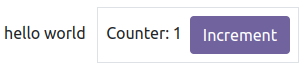
First, let us have a look at a simple example. The Counter component shown below is a component
that maintains an internal number value, displays it, and updates it whenever the user clicks on the
button.
import { Component, useState } from "@odoo/owl";

export class Counter extends Component {
    static template = "my_module.Counter";

    setup() {
        this.state = useState({ value: 0 });
    }

    increment() {
        this.state.value++;
    }
}
The Counter component specifies the name of a template that represents its html. It is written in XML
using the QWeb language:
<templates xml:space="preserve">
   <t t-name="my_module.Counter">
      <p>Counter: <t t-esc="state.value"/></p>
      <button class="btn btn-primary" t-on-click="increment">Increment</button>
   </t>
</templates>
۱. نمایش یک شمارنده
As a first exercise, let us modify the Playground component located in
awesome_owl/static/src/ to turn it into a counter. To see the result, you can go to the
/awesome_owl route with your browser.
Modify
playground.jsso that it acts as a counter like in the example above. KeepPlaygroundfor the class name. You will need to use the useState hook so that the component is re-rendered whenever any part of the state object that has been read by this component is modified.در همان کامپوننت، یک متد
incrementایجاد کنید.Modify the template in
playground.xmlso that it displays your counter variable. Use t-esc to output the data.Add a button in the template and specify a t-on-click attribute in the button to trigger the
incrementmethod whenever the button is clicked.
نکته
The Odoo JavaScript files downloaded by the browser are minified. For debugging purpose, it's easier when the files are not minified. Switch to debug mode with assets so that the files are not minified.
This exercise showcases an important feature of Owl: the reactivity system.
The useState function wraps a value in a proxy so Owl can keep track of which component
needs which part of the state, so it can be updated whenever a value has been changed. Try
removing the useState function and see what happens.
۲. استخراج Counter در یک زیرکامپوننت
For now we have the logic of a counter in the Playground component, but it is not reusable. Let us
see how to create a sub-component from it:
Extract the counter code from the
Playgroundcomponent into a newCountercomponent.You can do it in the same file first, but once it's done, update your code to move the
Counterin its own folder and file. Import it relatively from./counter/counter. Make sure the template is in its own file, with the same name.Use
<Counter/>in the template of thePlaygroundcomponent to add two counters in your playground.

نکته
By convention, most components code, template and css should have the same snake-cased name
as the component. For example, if we have a TodoList component, its code should be in
todo_list.js, todo_list.xml and if necessary, todo_list.scss
۳. یک کامپوننت سادهٔ Card
Components are really the most natural way to divide a complicated user interface into multiple reusable pieces. But to make them truly useful, it is necessary to be able to communicate some information between them. Let us see how a parent component can provide information to a sub component by using attributes (most commonly known as props).
The goal of this exercise is to create a Card component, that takes two props: title and content.
For example, here is how it could be used:
<Card title="'my title'" content="'some content'"/>
مثال بالا باید مقداری html با استفاده از bootstrap تولید کند که به این شکل باشد:
<div class="card d-inline-block m-2" style="width: 18rem;">
    <div class="card-body">
        <h5 class="card-title">my title</h5>
        <p class="card-text">
         some content
        </p>
    </div>
</div>
یک کامپوننت
Cardایجاد کنیدآن را در
Playgroundوارد کنید و چند کارت در قالب آن نمایش دهید

۴. استفاده از markup برای نمایش html
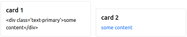
If you used t-esc in the previous exercise, then you may have noticed that Owl automatically escapes
its content. For example, if you try to display some html like this: <Card title="'my title'" content="this.html"/>
with this.html = "<div>some content</div>"",
the resulting output will simply display the html as a string.
In this case, since the Card component may be used to display any kind of content, it makes sense
to allow the user to display some html. This is done with the
t-out directive.
However, displaying arbitrary content as html is dangerous, it could be used to inject malicious code, so
by default, Owl will always escape a string unless it has been explicitely marked as safe with the markup
function.
Cardرا بهروزرسانی کنید تا ازt-outاستفاده کندPlaygroundرا بهروزرسانی کنید تاmarkupرا import کند و از آن روی مقادیر html استفاده کندMake sure that you see that normal strings are always escaped, unlike markuped strings.
توجه
The t-esc directive can still be used in Owl templates. It is slightly faster than t-out.
۵. اعتبارسنجی Props
The Card component has an implicit API. It expects to receive two strings in its props: the title
and the content. Let us make that API more
explicit. We can add a props definition that will let Owl perform a validation step in dev mode. You can activate the dev mode in the App
configuration (but it is activated by default
on the awesome_owl playground).
تمرین خوبی است که برای هر کامپوننت اعتبارسنجی props انجام دهید.
Add props validation to the
Cardcomponent.Rename the
titleprops into something else in the playground template, then check in the Console tab of your browser's dev tools that you can see an error.
۶. مجموع دو Counter
We saw in a previous exercise that props can be used to provide information from a parent
to a child component. Now, let us see how we can communicate information in the opposite
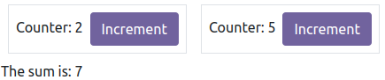
direction: in this exercise, we want to display two Counter components, and below them, the sum of
their values. So, the parent component (Playground) need to be informed whenever one of
the Counter value is changed.
This can be done by using a callback prop:
a prop that is a function meant to be called back. The child component can choose to call
that function with any argument. In our case, we will simply add an optional onChange prop that will
be called whenever the Counter component is incremented.
Add prop validation to the
Countercomponent: it should accept an optionalonChangefunction prop.Update the
Countercomponent to call theonChangeprop (if it exists) whenever it is incremented.Modify the
Playgroundcomponent to maintain a local state value (sum), initially set to 2, and display it in its templateیک متد
incrementSumدرPlaygroundپیادهسازی کنیدآن متد را بهعنوان یک prop به دو (یا بیشتر!) زیرکامپوننت
Counterبدهید.
مهم
There is a subtlety with callback props: they usually should be defined with the .bind
suffix. See the documentation.
۷. یک فهرست کارها
Let us now discover various features of Owl by creating a todo list. We need two components: a
TodoList component that will display a list of TodoItem components. The list of todos is a
state that should be maintained by the TodoList.
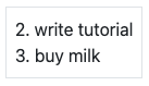
For this tutorial, a todo is an object that contains three values: an id (number), a description
(string) and a flag isCompleted (boolean):
{ id: 3, description: "buy milk", isCompleted: false }
کامپوننتهای
TodoListوTodoItemایجاد کنید.The
TodoItemcomponent should receive atodoas a prop, and display itsidanddescriptionin adiv.فعلاً، فهرست کارها را hardcode کنید:
// in TodoList
this.todos = useState([{ id: 3, description: "buy milk", isCompleted: false }]);
Use t-foreach to display each todo in a
TodoItem.یک
TodoListدر playground نمایش دهید.اعتبارسنجی props را به
TodoItemاضافه کنید.
نکته
Since the TodoList and TodoItem components are so tightly coupled, it makes
sense to put them in the same folder.
توجه
The t-foreach directive is not exactly the same in Owl as the QWeb python implementation: it
requires a t-key unique value, so that Owl can properly reconcile each element.
۸. استفاده از ویژگیهای پویا
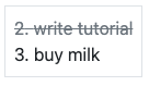
For now, the TodoItem component does not visually show if the todo is completed. Let us do that by
using a dynamic attributes.
Add the Bootstrap classes
text-mutedandtext-decoration-line-throughon theTodoItemroot element if it is completed.مقدار hardcoded شدهٔ
this.todosرا تغییر دهید تا بررسی کنید که بهدرستی نمایش داده میشود.
Even though the directive is named t-att (for attribute), it can be used to set a class value (and
html properties such as the value of an input).
نکته
Owl let you combine static class values with dynamic values. The following example will work as expected:
<div class="a" t-att-class="someExpression"/>
See also: Owl: Dynamic class attributes
۹. افزودن یک کار
So far, the todos in our list are hard-coded. Let us make it more useful by allowing the user to add a todo to the list.
مقادیر hardcoded شده در کامپوننت
TodoListرا حذف کنید:this.todos = useState([]);
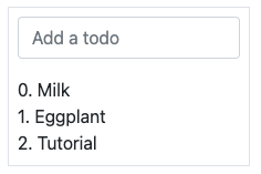
یک input بالای فهرست کارها با placeholder Enter a new task اضافه کنید.
Add an event handler on the
keyupevent namedaddTodo.Implement
addTodoto check if enter was pressed (ev.keyCode === 13), and in that case, create a new todo with the current content of the input as the description and clear the input of all content.Make sure the todo has a unique id. It can be just a counter that increments at each todo.
امتیاز اضافی: اگر input خالی است، کاری انجام ندهید.
همچنین ببینید
تئوری: چرخهٔ حیات کامپوننت و hookها
So far, we have seen one example of a hook function: useState. A hook
is a special function that hook into the internals of the component. In the case of
useState, it generates a proxy object linked to the current component. This is why
hook functions have to be called in the setup method, and no later!

An Owl component goes through a lot of phases: it can be instantiated, rendered, mounted, updated, detached, destroyed... This is the component lifecycle. The figure above show the most important events in the life of a component (hooks are shown in purple). Roughly speaking, a component is created, then updated (potentially many times), then is destroyed.
Owl provides a variety of built-in hooks functions. All of them have to be called in
the setup function. For example, if you want to execute some code when your component is mounted, you can use the onMounted
hook:
setup() {
  onMounted(() => {
    // do something here
  });
}
نکته
All hook functions start with use or on. For example: useState or onMounted.
۱۰. focus کردن input
Let's see how we can access the DOM with t-ref and useRef. The main idea is that you need to mark
the target element in the component template with a t-ref:
<div t-ref="some_name">hello</div>
Then you can access it in the JS with the useRef hook.
However, there is a problem if you think about it: the actual html element for a
component does not exist when the component is created. It only exists when the
component is mounted. But hooks have to be called in the setup method. So, useRef
return an object that contains a el (for element) key that is only defined when the
component is mounted.
setup() {
   this.myRef = useRef('some_name');
   onMounted(() => {
      console.log(this.myRef.el);
   });
}
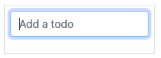
Focus the
inputfrom the previous exercise. This this should be done from theTodoListcomponent (note that there is afocusmethod on the input html element).Bonus point: extract the code into a specialized hook
useAutofocusin a newawesome_owl/utils.jsfile.
نکته
Refs are usually suffixed by Ref to make it obvious that they are special objects:
this.inputRef = useRef('input');
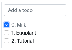
۱۱. تغییر وضعیت کارها
Now, let's add a new feature: mark a todo as completed. This is actually trickier than one might
think. The owner of the state is not the same as the component that displays it. So, the TodoItem
component needs to communicate to its parent that the todo state needs to be toggled. One classic
way to do this is by adding a callback prop toggleState.
Add an input with the attribute
type="checkbox"before the id of the task, which must be checked if the stateisCompletedis true.نکته
Owl does not create attributes computed with the
t-attdirective if it evaluates to a falsy value.یک props callback به نام
toggleStateبهTodoItemاضافه کنید.Add a
changeevent handler on the input in theTodoItemcomponent and make sure it calls thetoggleStatefunction with the todo id.آن را کار بیندازید!
۱۲. حذف کارها
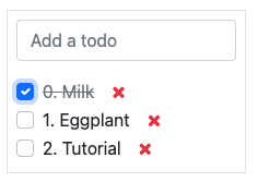
آخرین مرحله این است که به کاربر اجازه دهیم یک کار را حذف کند.
یک callback prop جدید به نام
removeTodoدرTodoItemاضافه کنید.Insert
<span class="fa fa-remove"/>in the template of theTodoItemcomponent.هر زمان که کاربر روی آن کلیک کرد، باید متد
removeTodoفراخوانی شود.آن را کار بیندازید!
نکته
If you're using an array to store your todo list, you can use the JavaScript
splicefunction to remove a todo from it.
// find the index of the element to delete
const index = list.findIndex((elem) => elem.id === elemId);
if (index >= 0) {
      // remove the element at index from list
      list.splice(index, 1);
}
۱۳. Card عمومی با slotها
In a previous exercise, we built
a simple Card component. But it is honestly quite limited. What if we want
to display some arbitrary content inside a card, such as a sub-component? Well,
it does not work, since the content of the card is described by a string. It would
however be very convenient if we could describe the content as a piece of template.
This is exactly what Owl's slot system is designed for: allowing to write generic components.
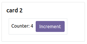
بیایید کامپوننت Card را تغییر دهیم تا از slotها استفاده کند:
prop
contentرا حذف کنید.از slot پیشفرض برای تعریف بدنه استفاده کنید.
چند کارت با محتوای دلخواه، مانند یک کامپوننت
Counter، درج کنید.(امتیاز اضافی) اعتبارسنجی prop را اضافه کنید.
همچنین ببینید
۱۴. کمینهسازی محتوای کارت
Finally, let's add a feature to the Card component, to make it more interesting: we
want a button to toggle its content (show it or hide it)
یک state به کامپوننت
Cardاضافه کنید تا پیگیری کند که باز است (پیشفرض) یا نهیک
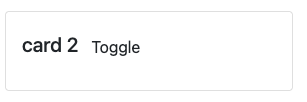
t-ifبه قالب اضافه کنید تا محتوا را بهصورت شرطی رندر کندAdd a button in the header, and modify the code to flip the state when the button is clicked